IMPORTACIONES HJ

Challenge
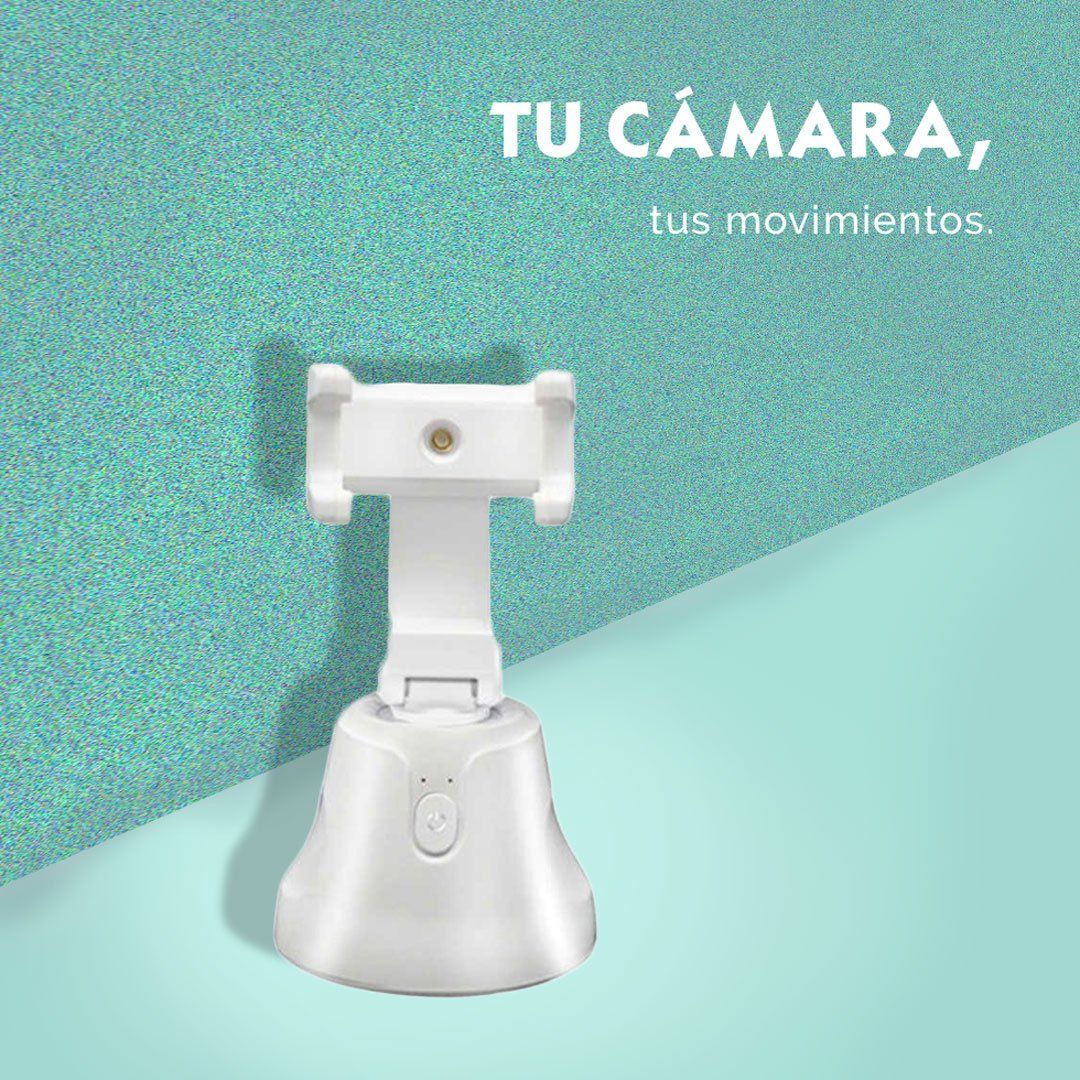
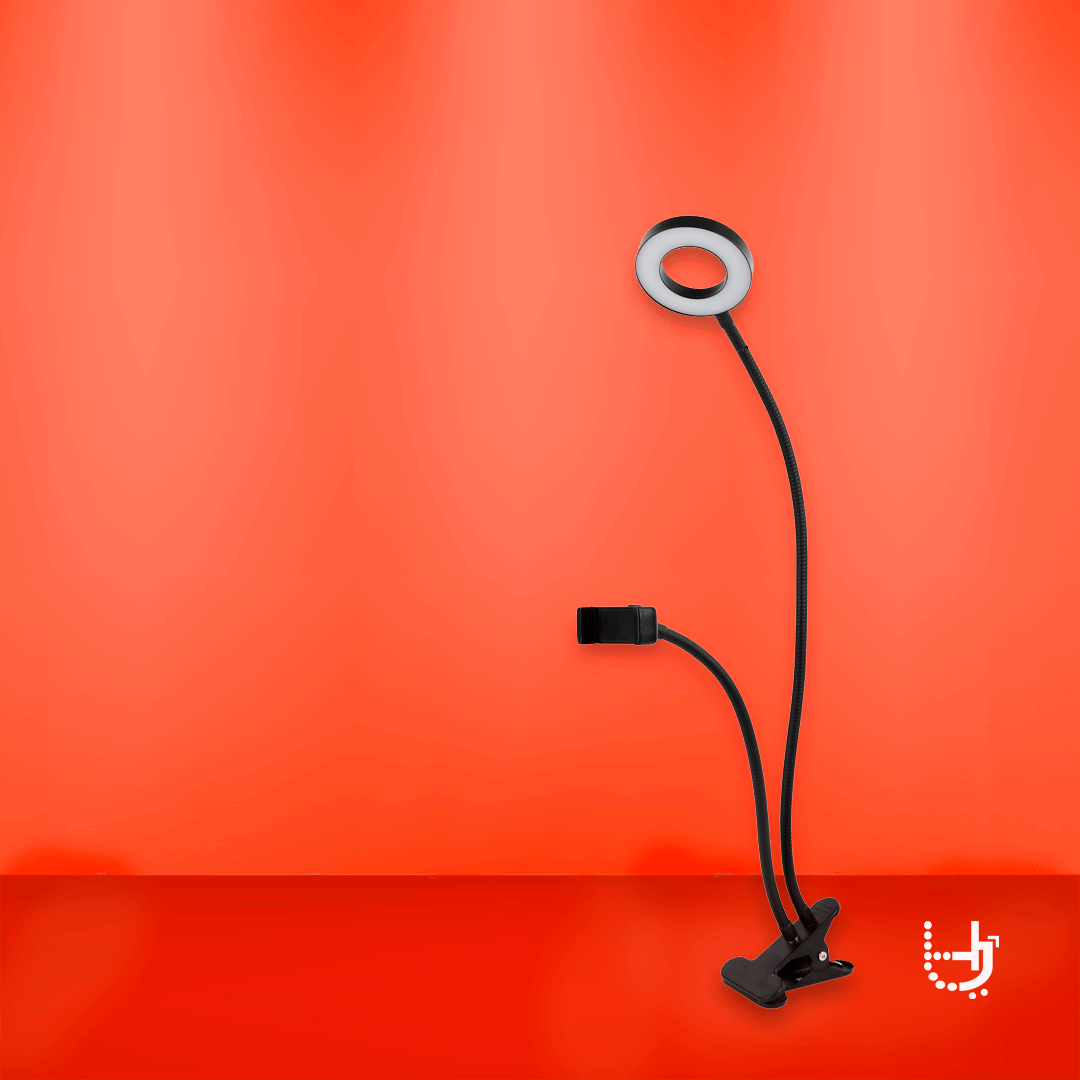
Importaciones HJ wanted to be visualized as a youthful, stylish and eye-catching brand recognized for providing modern and innovative products. It was extremely important to convey these key elements of the brand within the entire branding process.
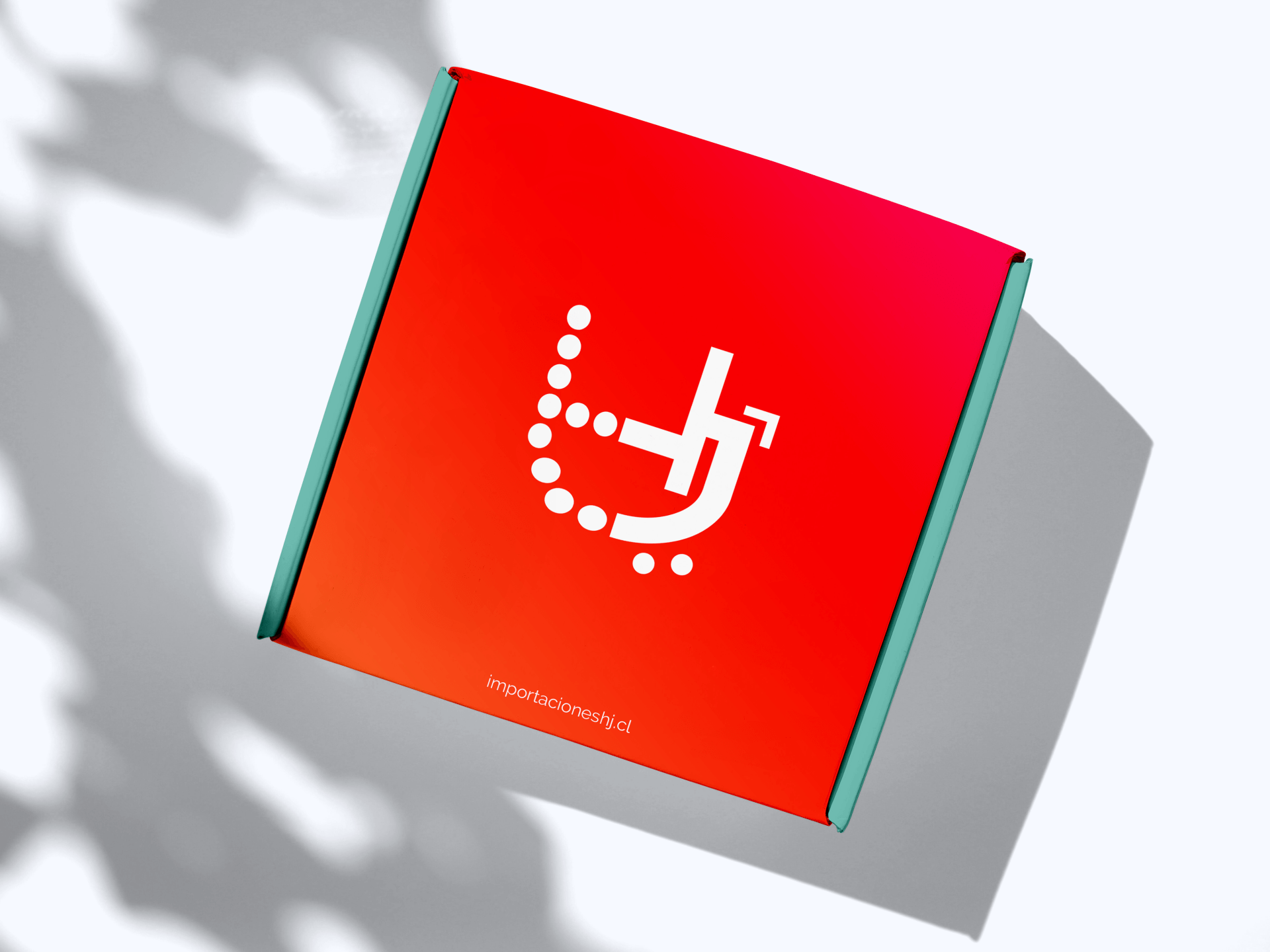
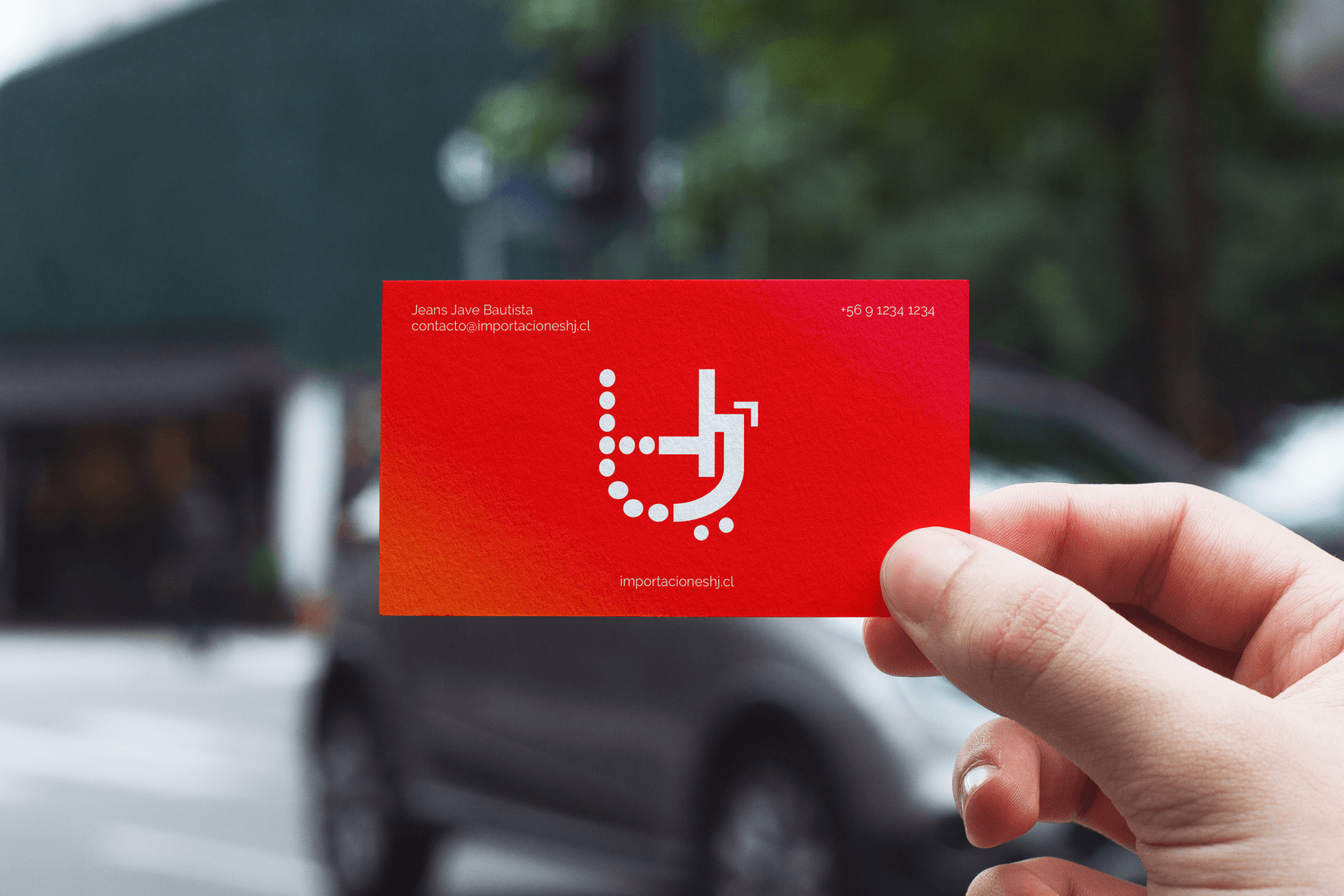
The brand concept was born from the acronym HJ, alluding to the process of importation in a subjective manner, through the various circles or dots that represent the transfer of products from one point to another. The dots and arrow indicate movement and progress. The arrow also refers to a mouse cursor. If you look at the abstract illustration you can see a shopping cart. The colors used generate a high contrast which makes it striking and youthful.
Brand Values
Youthful Stylish Innovative Eye-catching